How Cap Rates Differ by Market
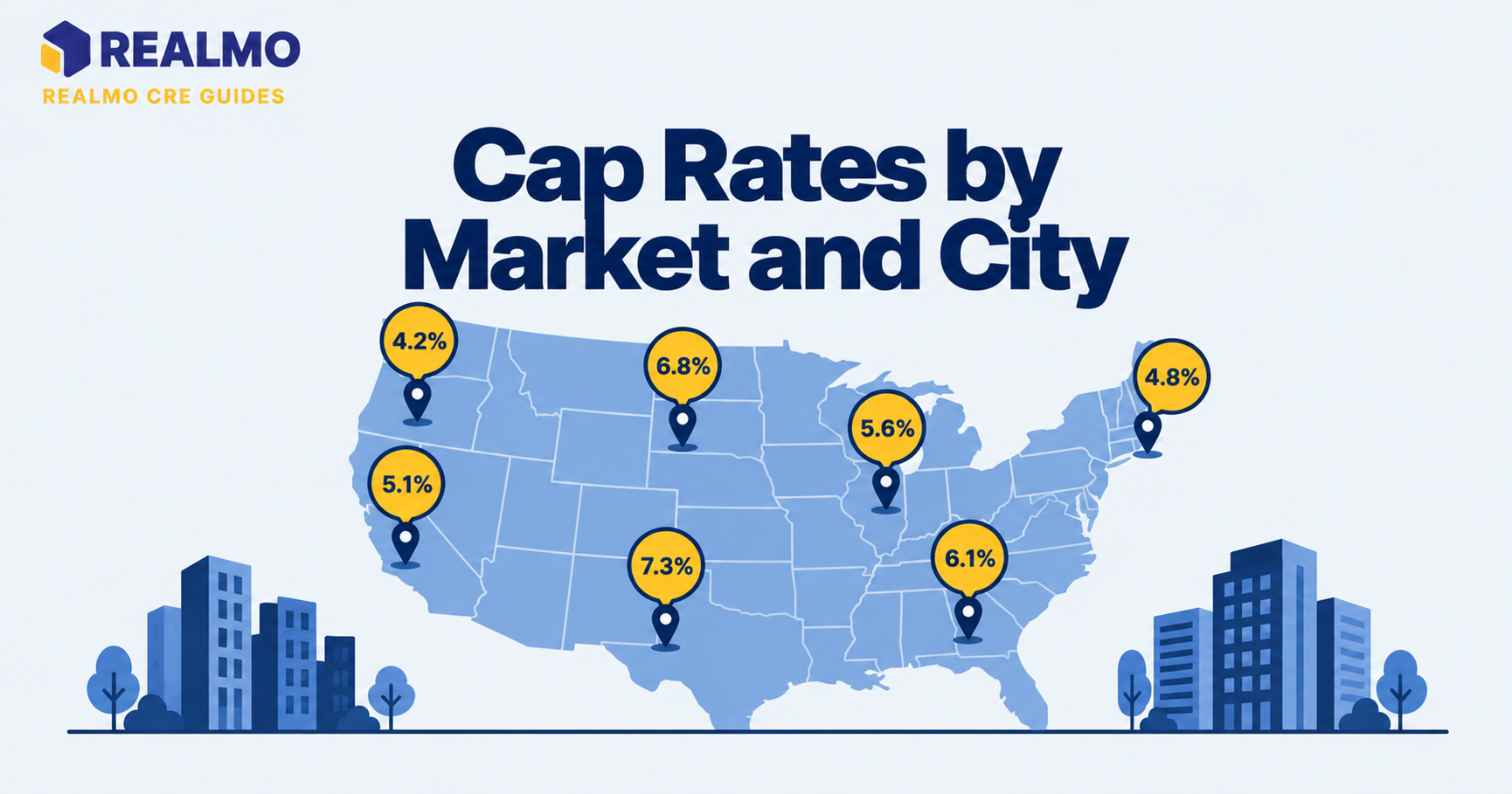
Cap rates by market differ because a capitalization rate prices local risk, liquidity, and expected rent growth, not just a building’s in-place income. The same asset type trades at a tighter cap rate in a deep metro with reliable exit buyers, and at a wider one where demand is thin, financing is harder, and future rent growth is uncertain.
Why the spread between markets decides your deal
An investor comparing a small industrial building in a top-ten metro against a nearly identical building in a mid-sized Midwestern city will find the second one priced two full points higher on cap rate. On paper the second deal wins: more current yield, easier debt coverage, lower entry price per square foot, but the pricing gap exists for reasons that show up later, a shorter list of buyers at exit. A tenant pool concentrated in one or two industries, and rent growth that has historically tracked inflation rather than outrunning it.
Reading that spread correctly is the difference between buying yield and buying risk you didn’t price. Every underwriting decision downstream, hold period, exit assumption, loan sizing, depends on understanding why one market clears at a lower number than another.
What actually drives cap rate spreads between metros
Six structural forces explain most of the dispersion, and none of them are about the building itself.
Buyer depth. A market with institutional owners, foreign capital, and active 1031 exchange demand has more bidders per listing. More bidders means tighter pricing and faster clearing. Thin markets require a seller to find the one buyer who wants that asset. This shows up as a wider cap rate and a longer marketing period.
Expected rent growth. A cap rate is roughly the return an investor demands minus the growth they expect. Markets with in-migration, employment diversity, and constrained development pipelines get credit for future growth, and that credit compresses the cap rate today.
Supply elasticity. Where land is cheap and entitlement is fast, new supply arrives whenever rents rise, capping growth. Where topography, zoning, or entitlement timelines restrict building, existing assets hold pricing power. Barriers to entry are worth real basis points.
Operating cost structure. Property taxes, insurance, and labor vary enormously by state and county, and they hit net operating income before the cap rate is ever applied. Coastal wind and wildfire exposure has repriced insurance in some regions. States that reassess property at the time of sale hand the buyer a tax bill the seller never paid.
Debt availability. Lenders maintain internal market tiers. A metro on a lender’s preferred list gets more proceeds and better terms; a tertiary market may get lower leverage or no bid at all. Financing terms flow straight into what buyers can pay.
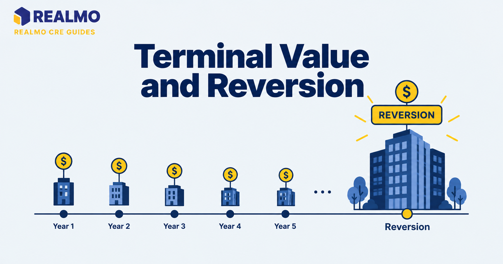
Exit risk. Everything above compounds at sale. If your buyer pool five years out is smaller than yours was, you need a higher going-in yield to be compensated. See going-in vs. exit cap rate for how that assumption is modeled.
Why gateway markets price tighter than secondary ones
Large coastal and gateway metros consistently clear at lower cap rates than secondary and tertiary markets for the same product. The premium buyers pay is partly for growth and partly for liquidity, the ability to sell in a soft market without accepting a distressed price.
The trade-off is return composition. A low-cap-rate market delivers less current income and more of its total return through appreciation, which means the outcome depends heavily on the exit. A high-cap-rate market delivers more of its return in cash from day one. This is a better fit for an investor who needs distributions and is comfortable holding through a slow sale. Neither is inherently superior; they are different risk profiles wearing the same metric.
Gateway markets also tend to be more volatile in repricing cycles. This is because the institutional capital that bids them up is the same capital that steps back quickly when return targets move. Secondary markets reprice more slowly, though with wider bid-ask spreads and fewer completed trades to prove where value actually sits.
How property type changes the market-to-market gap
Comparing cap rates across markets only works when property type, class, vintage, and lease structure are held constant. The size of the geographic spread is not the same for every asset class.
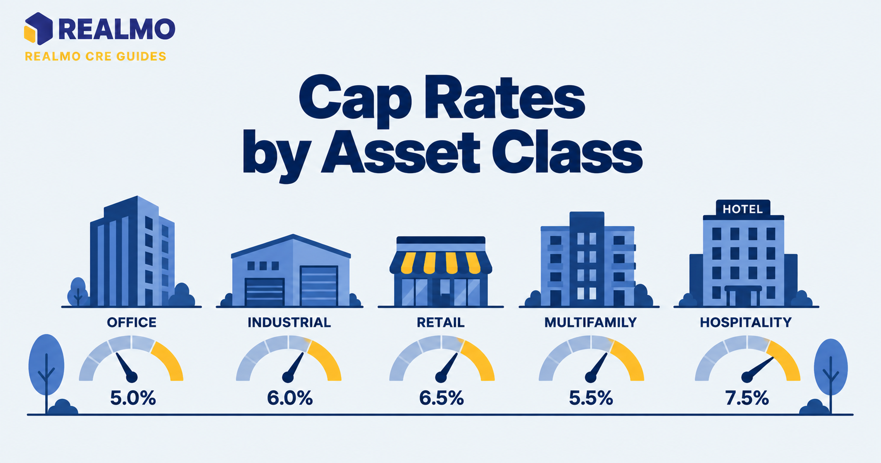
Multifamily shows the narrowest geographic dispersion of the major food groups, largely. This is because agency lenders (Fannie Mae and Freddie Mac) provide financing on similar terms nationwide, which supports pricing in markets that would otherwise get thinner bids. Net-leased assets under triple net lease structures are priced primarily on tenant credit and lease term, so a corporate-guaranteed pharmacy trades within a narrower band across geographies than an unanchored strip center. Hotels are priced on operating performance, so location matters, but through revenue per available room rather than through a location premium applied to a stable income stream.
Office carries the widest dispersion, because tenant demand, building quality, and capital expenditure requirements diverge sharply between markets, and even between buildings across the street from each other.
Where submarket detail beats metro-level averages
A published metro cap rate is an average across submarkets, vintages, classes, and deal sizes. It is a starting reference, not an underwriting input.
Within a single metro, an infill submarket with no developable land, and a suburban node with 200 acres of entitled sites will not price the same way, even for identical buildings. Deal size matters too: sub-$5 million assets are bought by private investors, and 1031 buyers using local banks, while larger trades draw institutional bidders, two distinct pricing environments inside one market.
Useful comparison holds as many variables constant as possible: same submarket, similar vintage, comparable tenancy and remaining lease term, similar deal size. That is the logic behind a proper comparable sales analysis, and it is why brokers rarely quote a single number for a metro without qualifying it. Realmo’s property analytics show valuation and cap rate estimates at the individual asset level across the U.S., which makes it easier to test a metro-level assumption against the specific block you’re underwriting.
Worked example: same NOI, two markets
All figures below are illustrative and rounded for clarity.
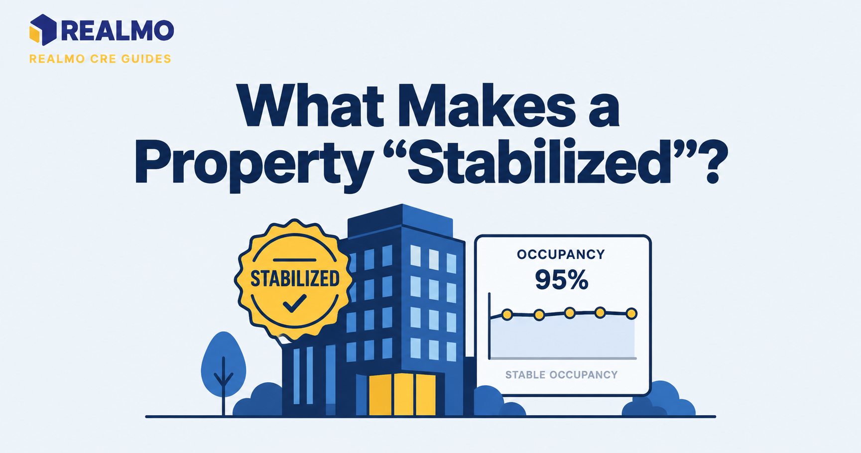
A stabilized single-tenant industrial building produces $500,000 of annual NOI. It exists, hypothetically, in two markets.
- Market A (deep buyer pool, constrained supply), 5.0% cap rate → $500,000 ÷ 0.050 = $10,000,000
- Market B (thin buyer pool, elastic supply), 7.0% cap rate → $500,000 ÷ 0.070 = $7,142,857
Identical income, a $2.86 million difference in value. Now test the assumption behind the spread. Assume Market A rents grow at an illustrative 3% annually and Market B at 1%. After five years, Market A NOI is roughly $579,600 and Market B is roughly $525,500. Hold both exit cap rates flat: Market A exits near $11.59 million, Market B near $7.51 million. Market A gained about $1.59 million in value; Market B gained about $364,000.
How to interpret it. The 200-basis-point spread is a price on the growth differential and on exit certainty. Market B compensates you in cash flow every year, and that cash is certain in a way the growth assumption never is. Market A only wins if the growth actually materializes and the exit cap rate holds, two assumptions, not one. Run the calculation both ways before deciding which risk you’d rather hold, and check the result against cash-on-cash return, and debt service coverage ratio under real loan terms.
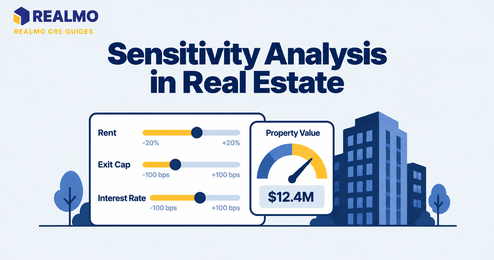
The common error here. Investors extend the growth assumption to five years but never stress the exit cap rate. If Market A’s exit cap widens by 50 basis points, most of that $1.59 million gain disappears.
Common mistakes when comparing cap rates by market
Comparing a market average to a specific deal. Published averages usually reflect stabilized, institutional-quality trades. Applying one to a value-add asset with rollover risk overstates value, sometimes badly enough to lose the deal or overpay for it.
Ignoring NOI definition differences. If one seller’s NOI excludes management fees, reserves, or a full-year tax reassessment, the resulting cap rate isn’t comparable to anything. Normalize expenses first, the method is covered in how to calculate cap rate.
Treating a high cap rate as a bargain. A wide cap rate is usually the market’s honest assessment of risk: shorter lease terms, weaker tenant credit, functional obsolescence, or a shrinking employment base. The yield is compensation, not a discount.
Underwriting the exit at the going-in rate. Assuming you sell at the cap rate you bought at removes the single largest variable in the return. Test the exit wider, particularly in markets where the buyer pool is narrow.
Skipping the risk-free benchmark. A cap rate has meaning relative to prevailing yields on long-dated Treasuries, published daily by the U.S. Treasury and tracked in the Federal Reserve’s FRED database. Two markets at the same nominal cap rate can carry very different real risk premiums. See cap rate spread over Treasuries.
Cap rate comparisons are analytical tools, not valuation opinions. For a specific acquisition, consult a licensed appraiser and your tax advisor before relying on any figure.
Related terms
Capitalization rate · Net operating income · Exit cap rate · Cash-on-cash return · Internal rate of return · Sales comparison approach · Debt service coverage ratio · Gross rent multiplier
FAQ
Why are cap rates lower in major cities?
Larger metros have deeper buyer pools, more available financing, and stronger expected rent growth. Buyers accept a lower current yield because they expect income to grow and because they can sell more easily later. The lower cap rate prices both growth and liquidity, not just prestige.
Is a higher cap rate market always better for cash flow?
Higher cap rates do produce more current income per dollar invested, which supports distributions and debt coverage. The offset is exit risk, slower rent growth, and a smaller buyer pool at sale. Whether that trade works depends on your hold period and whether you need current income or total return.
How much do cap rates vary within a single metro?
Substantially. Infill submarkets with supply constraints price well inside suburban nodes with available land, and deal size splits the market further, since private and institutional buyers bid differently. Metro averages should be treated as orientation, not as an underwriting input for a specific asset.
Do cap rate differences between markets stay constant over time?
No. Spreads widen and compress with capital flows, lending conditions, and shifts in regional employment. Gateway markets reprice faster because institutional capital moves quickly; secondary markets lag with fewer completed trades to establish where pricing has landed.
Which property type shows the widest cap rate spread between markets?
Office shows the widest dispersion, because tenant demand and capital expenditure needs diverge sharply by market and building. Multifamily tends to show the narrowest, supported by agency financing available on comparable terms nationwide.